New World Square
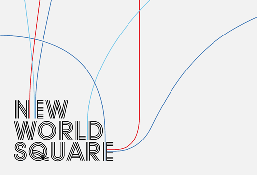
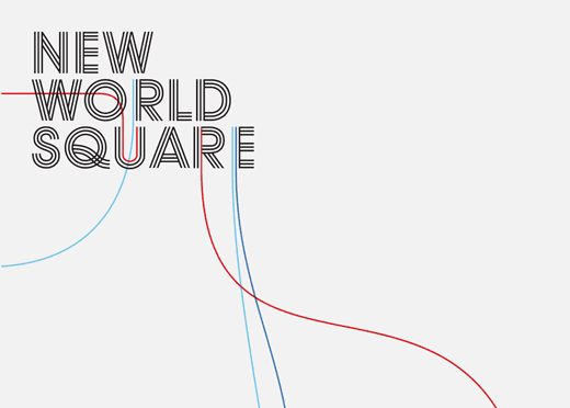
Identity for a large hotel and mixed-use development to be built at the pier in Liverpool. As this is the location from where ships leave to the New World we developed a logo version that features shipping lines coming out from the letters. The logo is flexible, it can change colour and the lines can go into different directions. Eventually the lines will lead from the signage across the street directly into the water. The lettering combines elements of Modernism and Op-art from the Sixties, a period that made Liverpool famous all over the world. The building work of New World Square has been delayed by the recession but we are still hopeful that it will start soon.


