PearsonLloyd
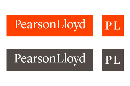
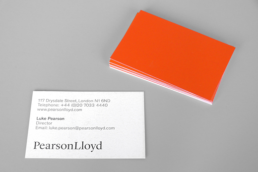
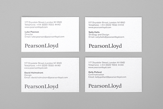
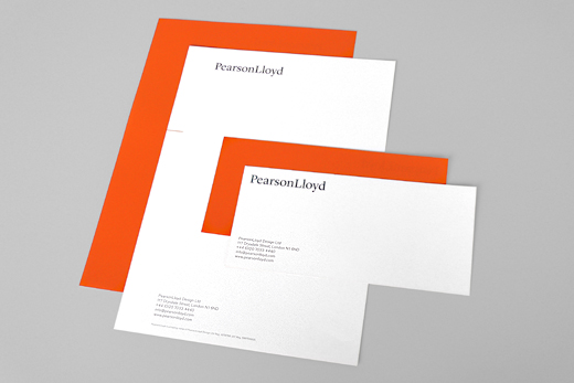
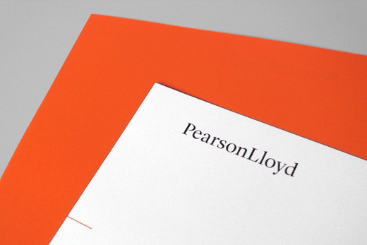
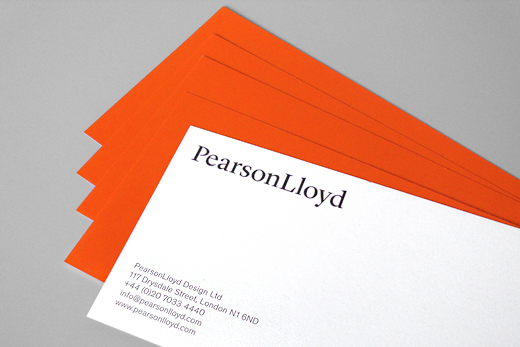
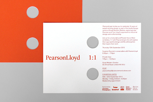
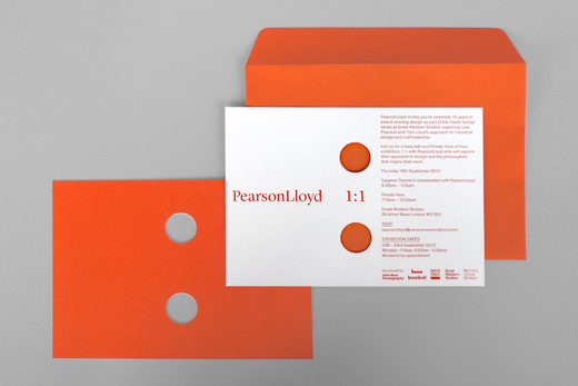
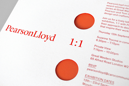
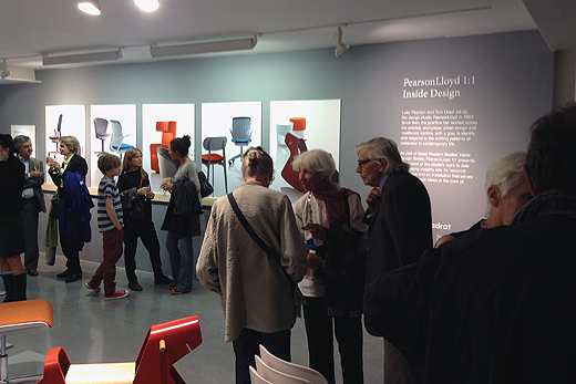
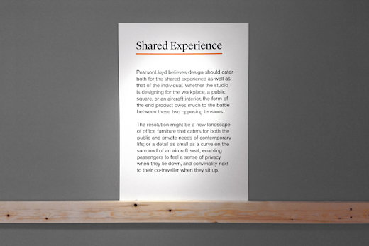
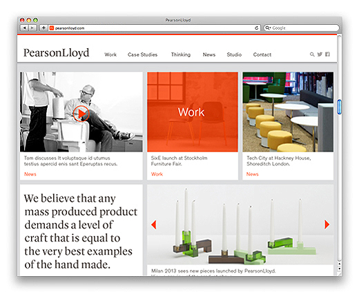
We re-designed the overall identity, all collateral material and the website for the established product design studio PearsonLloyd. The original identity wasn't bad, Helvetica bold, tight leading, the company name in pink. It just felt a little dated and predictable. On the one side it said we are clean and organised, on the other we are friendly and pretty in pink. PearsonLoyd had grown up in the meantime and also needed a much more functional website. We swapped the cute pink for a strong confident orange and sans serif for serif. The extend of the identity re-design might not be represented very well here on our website. Beside the new logo and visual language we designed various print and digital presentation templates, all their internal and external communication, invitations, exhibition graphics and another project related website.
→ PearsonLloyd in the web section
www.pearsonlloyd.com