Belle Epoque
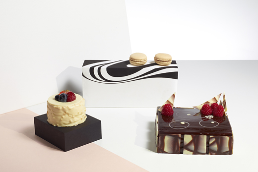
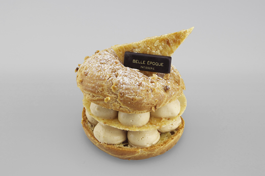
This is a project we almost did not want to do. It started out as just another web job for a cafe that already had a logo (we have done so many already). However, we went down from the meeting room into the kitchen and tasted Erics cakes. That convinced us. This man is a real artist with a total passion for what he does. We managed to convince our new client to change the logo and let us do a complete re-design of everything (yes, we also did the website).
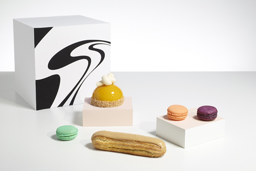
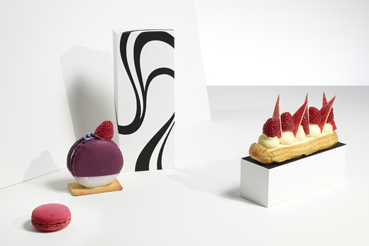
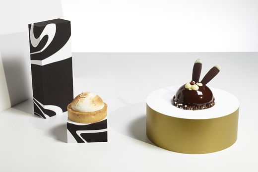
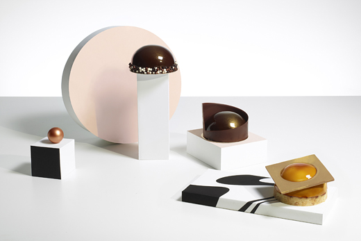
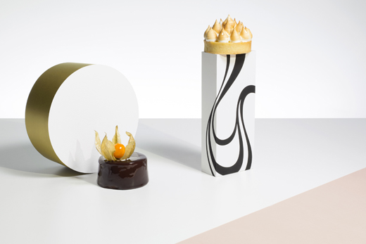
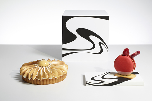
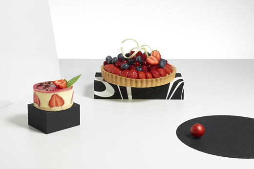
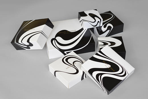
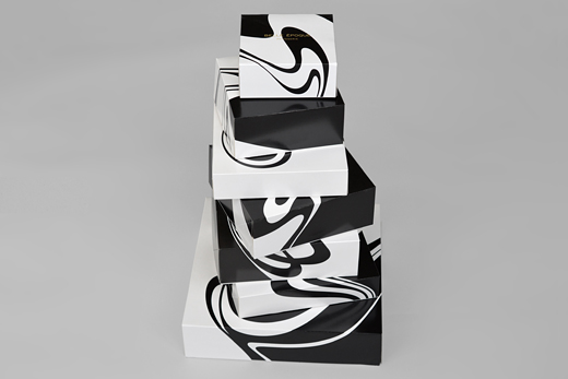
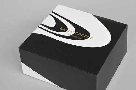
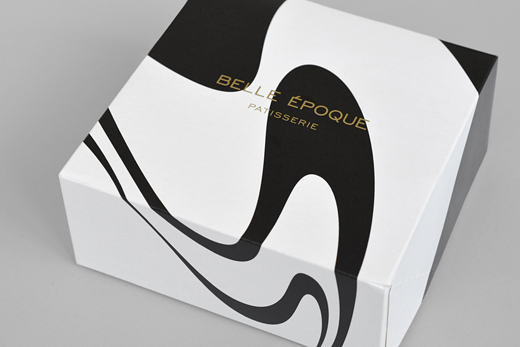
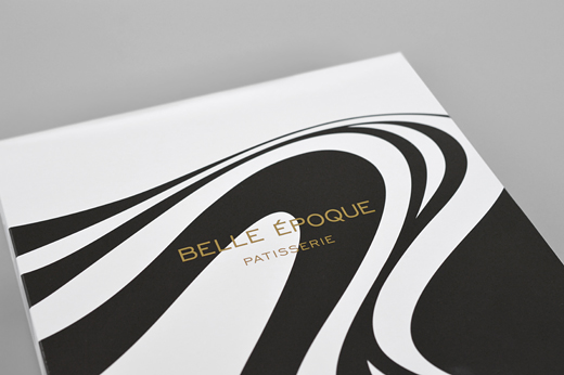
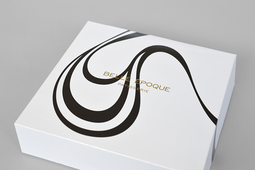
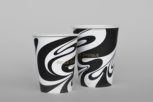
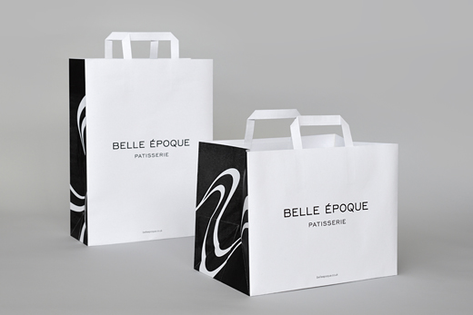
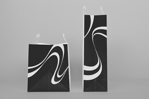
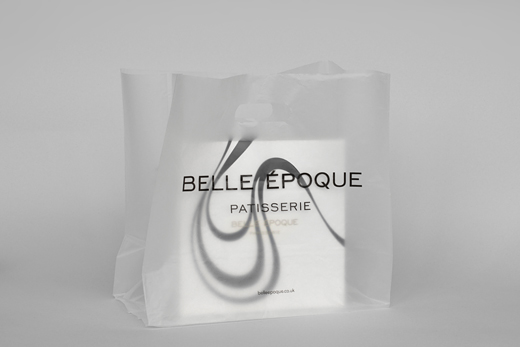
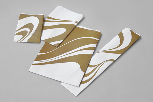
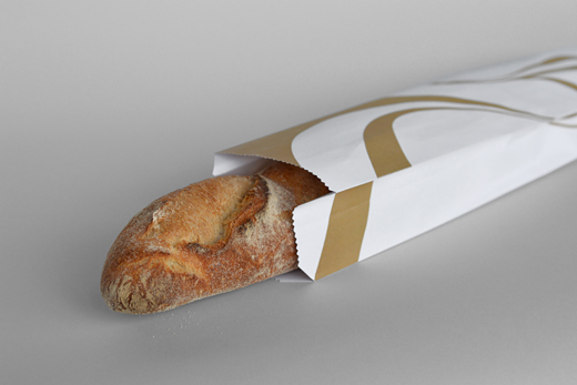
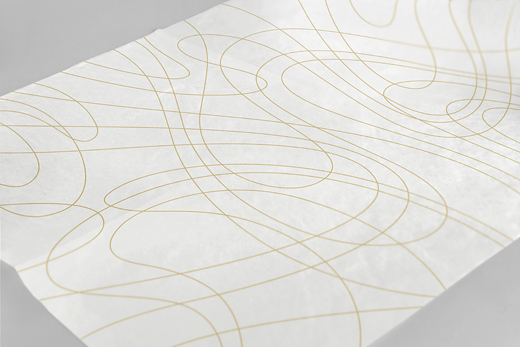
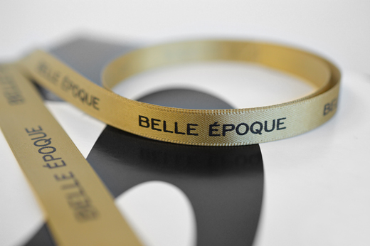
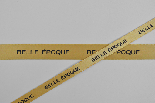
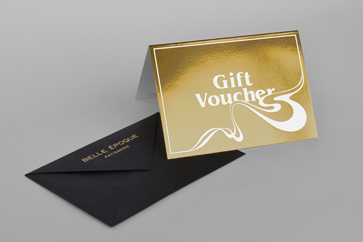
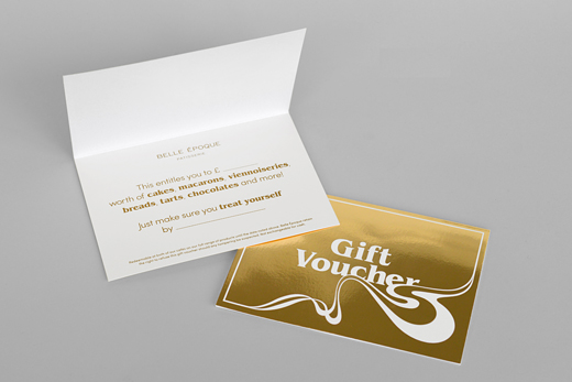
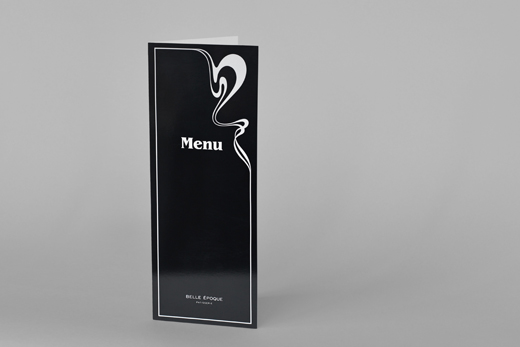
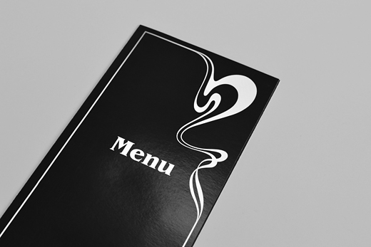
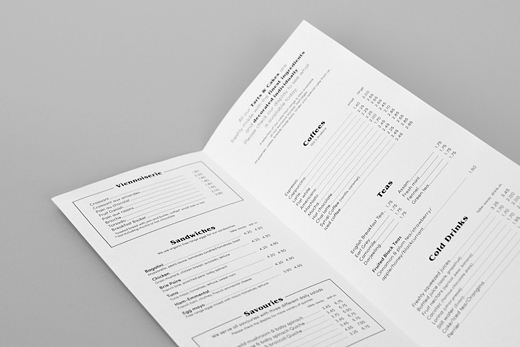
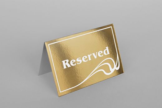
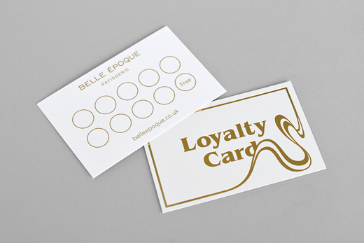
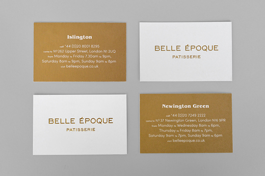
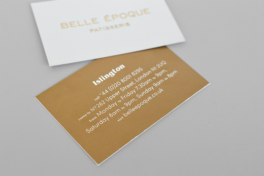
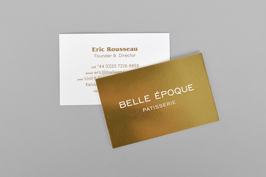
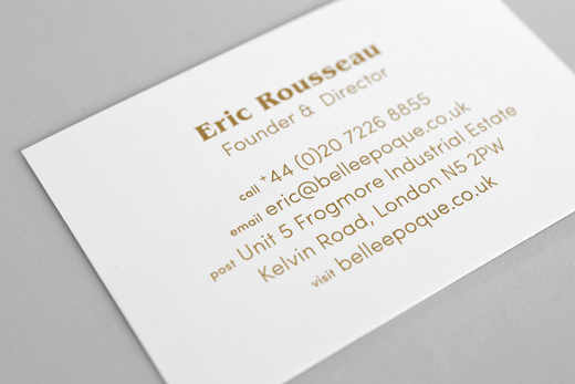
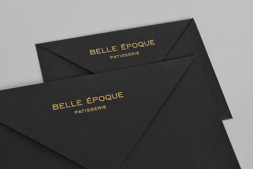
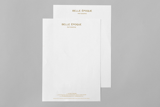
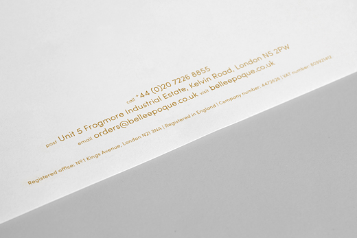
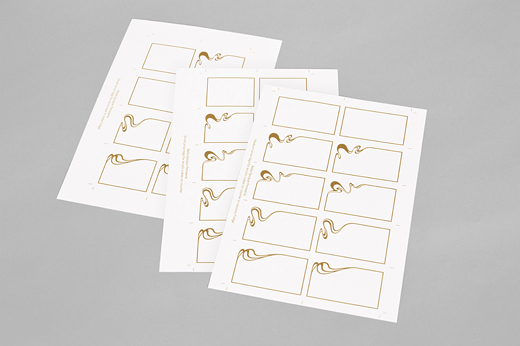
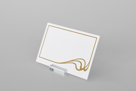
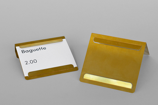
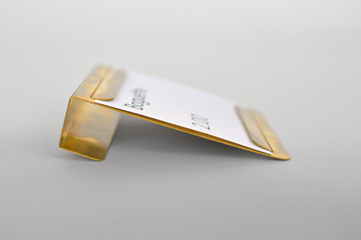
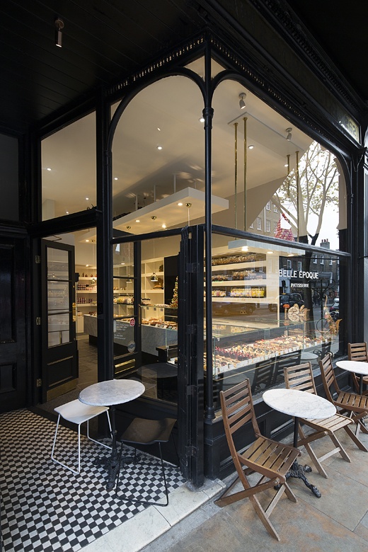
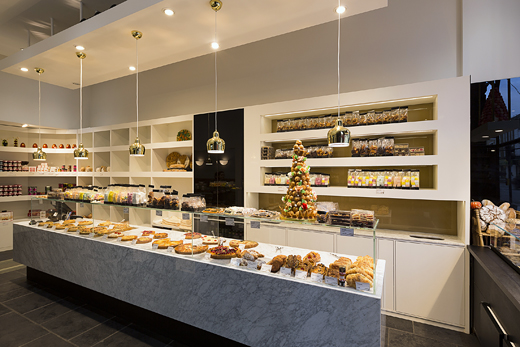
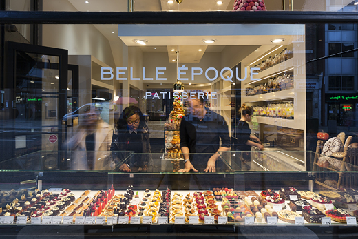
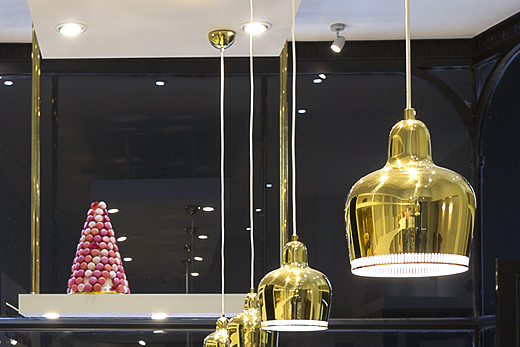
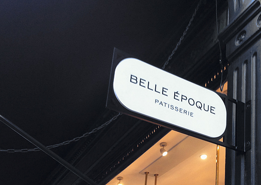
Belle Epoque is a French Patisserie on Upper Street in London. The identity is based on the drawings by the English Art Nouveau artist Aubrey Beardsley. The Logo is relatively simple as the emphasis is on the pattern and photography. The typography links the Art Nouveau period with the Hippie movement of the Sixties where we see quite a few connections. Beside the overall print, web, packaging, signage and some interior design we developed a photo concept that links the products with the overall identity.
We have not taken photographs of everything yet so watch this space (and go and try the cakes).
www.belleepoque.co.uk