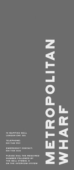
Metropolitan Wharf
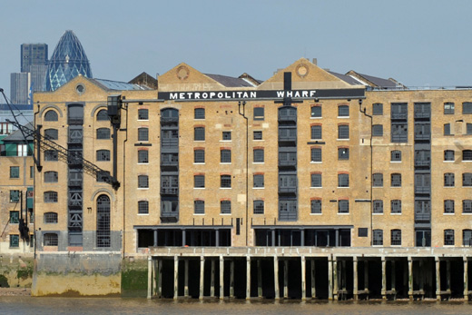
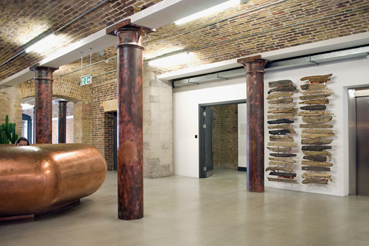
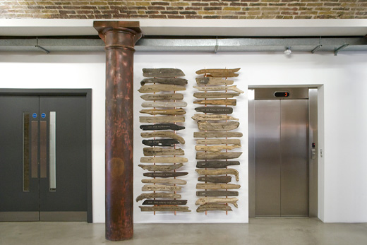
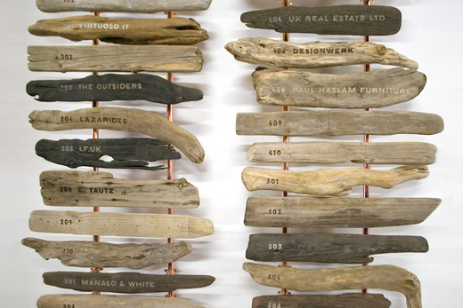
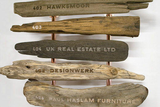
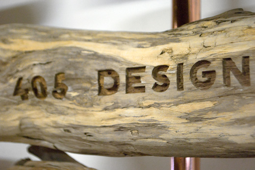
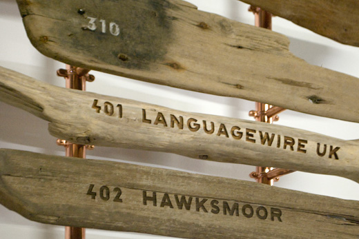
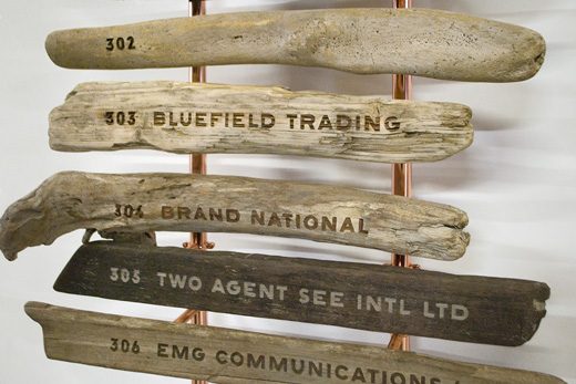
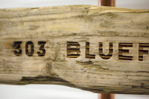
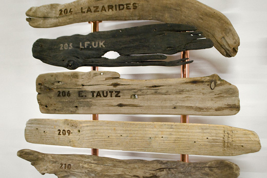
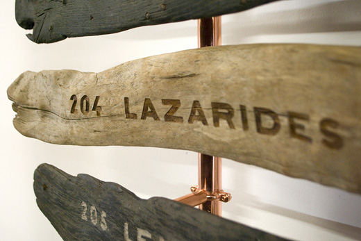
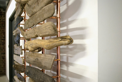
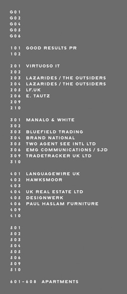
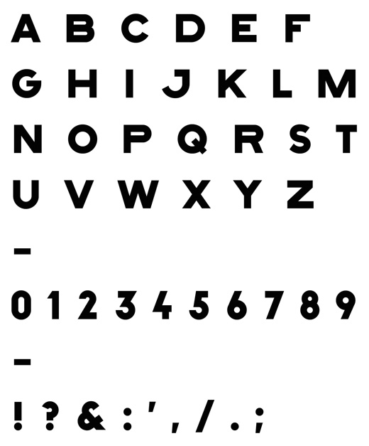
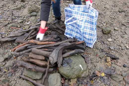
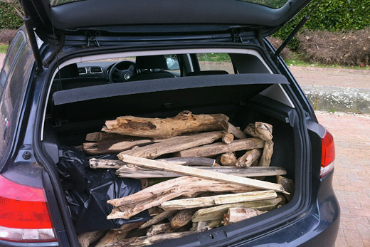
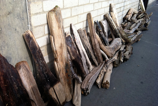
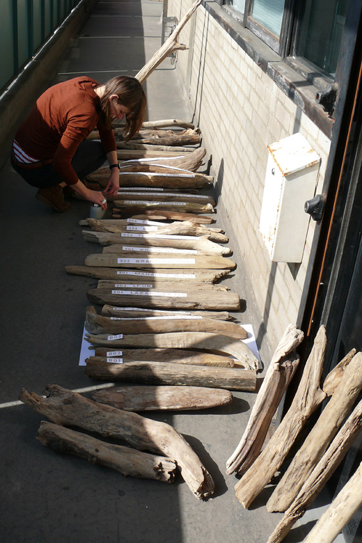
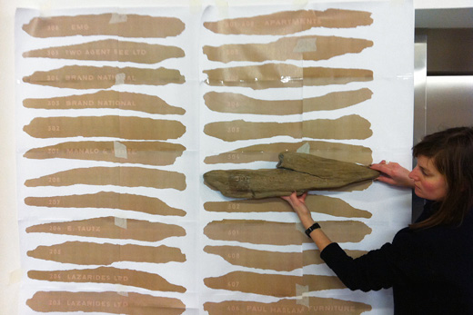
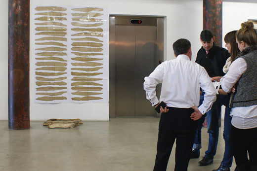
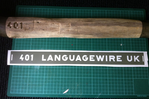
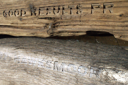
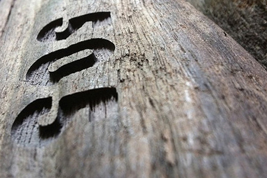
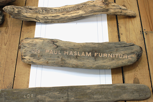
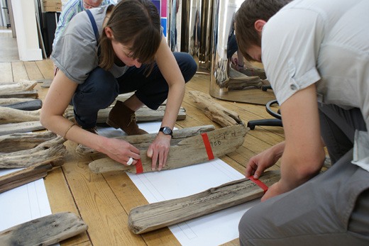
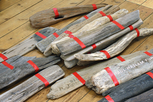
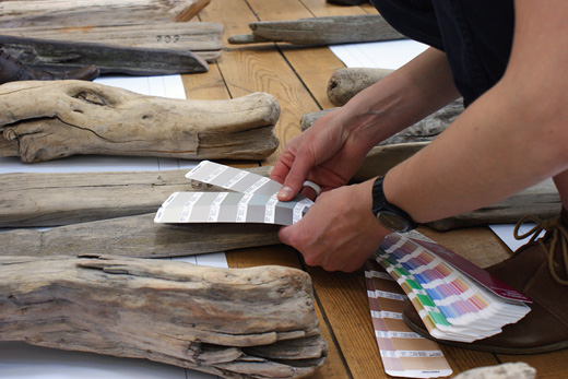
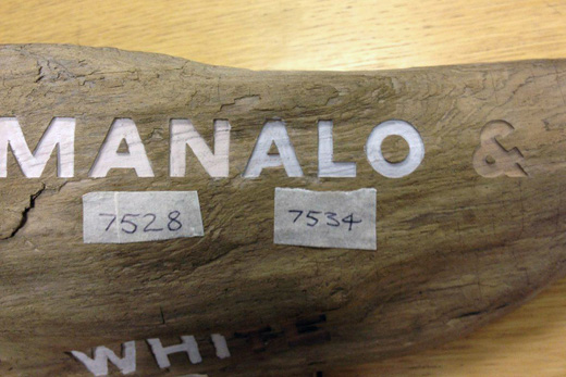
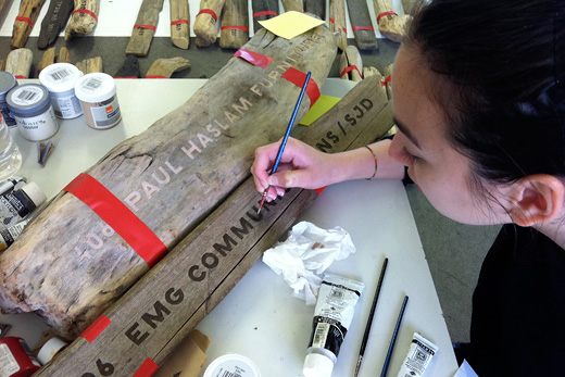
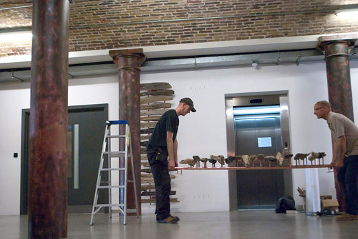
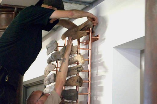
We designed the signage and a customised font for the Metropolitan Wharf building. Since the development is located on the embankment of the River Thames it was an obvious idea to use driftwood for the tenants board. Easier said than done. Although it now looks simple and easy, this project was technically quite challenging. We first had to find driftwood at the right dimension, then clean it, dry it and work out how to write on it. We opted for sandblasting but had to enhance some of the lettering with wood dye later. Each piece had to be drilled from the back and fitted with studs which clamped onto large copper rails. This way each sign can be removed individually and exchanged in case new tenants move in. About half of the units are still unoccupied and the new names will be added later. The typeface we designed matches the historic lettering on the outside of the building, the font has two versions, one for sandblasting and one for printing.
→ Metropolitan Wharf in the typedesign section