Logo Marathon
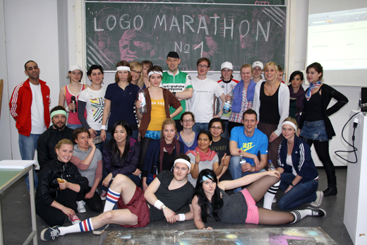
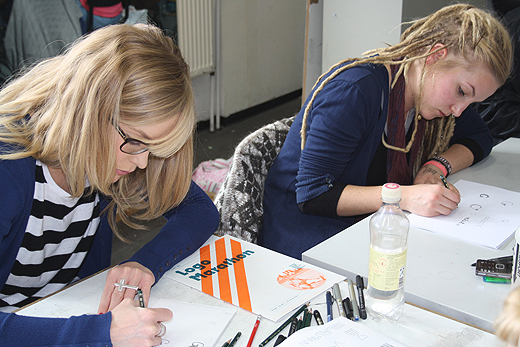
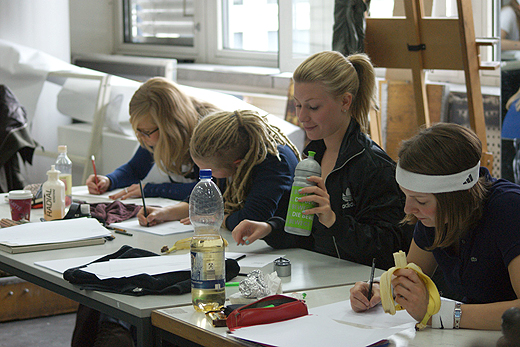
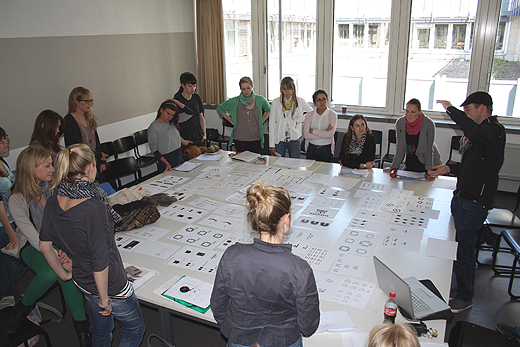
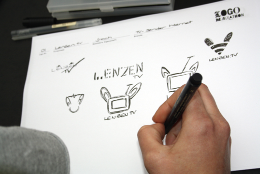
It takes the average runner about 4 hours to run the 42 kilometer distance of a marathon. Following these parameters, we set out to design 42 logos in 4 hours. That's one every 6 minutes. For the initial test run a website was set up that generated a random combination of three words: a name, a characteristic and a business type. Every six minutes the combination changed and a new 'brief' was set. The aim of the experiment was to work more intuitively, spontaneously and to learn how to trust an initial 'gut feeling'. Obviously a quickly sketched logo does not make a full corporate identity. However, in professional Corporate Design practice the strategy andĀdevelopmentĀstage often seems artificially overblown while the actual logo originates from a quick sketch on a napkin. Our intention was to explore this 'initial spark' of creativity.Ā
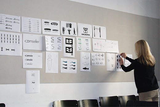
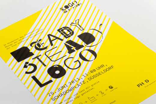
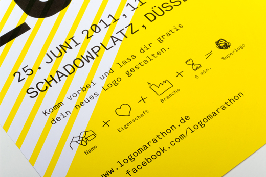
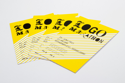
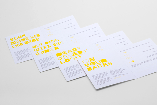
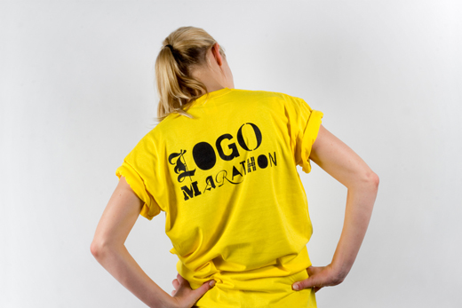
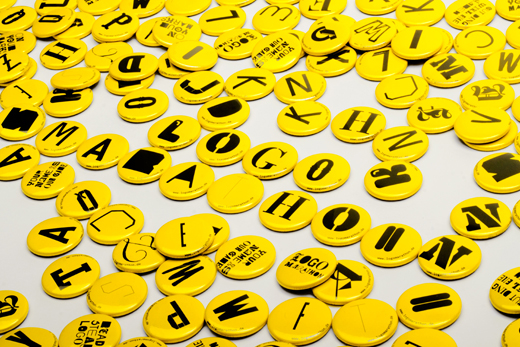
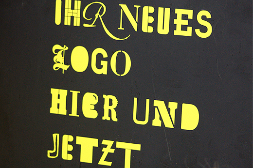
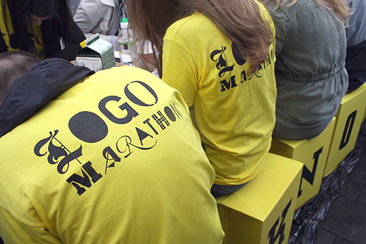
After the initial logo sketches from the first marathon were selected we turned them into proper clean drawings. Hereby it was important not to move too far away from the original sketch. The results turned out to be very original and so it was decided to run the Logo Marathon as a public event in D³sseldorf's city centre. As well trained speed designers we wanted to test our newly developed skills on real people and real briefs. We designed a corporate identity for the event (your logo here and now in 6 minutes), put up posters in small shops, bars and doner kebab restaurants. A heated discussion on designtagebuch.de developedĀarguing that our approach would damage the whole design industry and ruin the prices. Needless to say that the whole event was free and it was not intended to discuss money but to explore a different way of working. Funny to see how worried and protective the industry gets when it comes to logos. Nobody would have raised a voice if we would have drawn six minute portraits of people.Ā
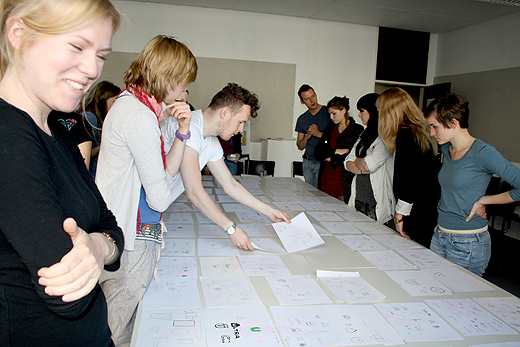
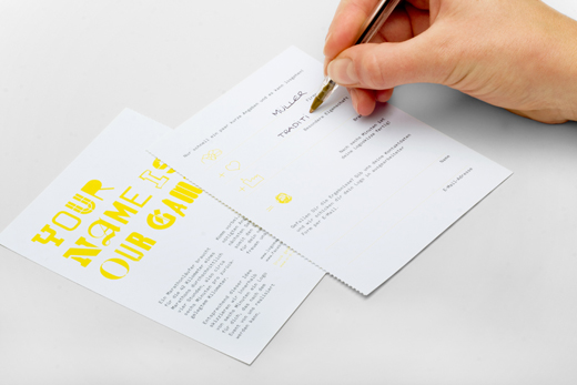
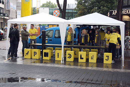
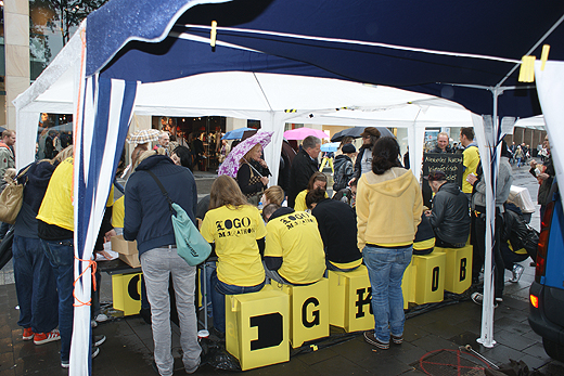
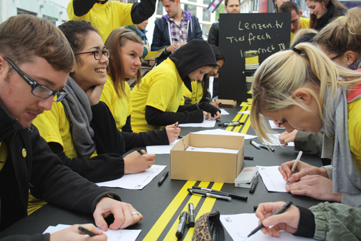
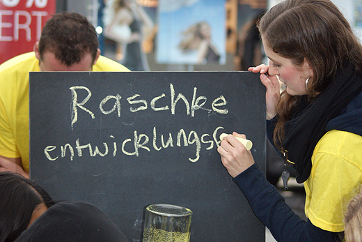
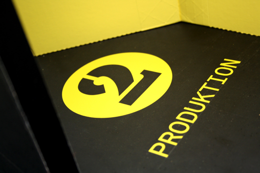
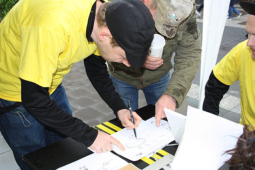
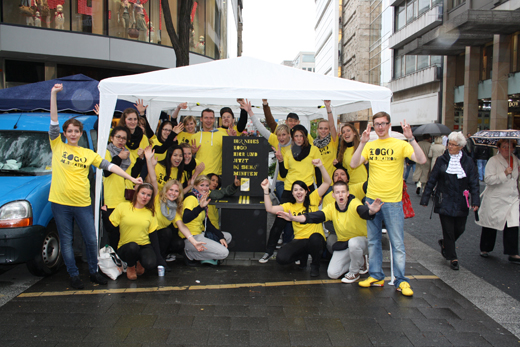
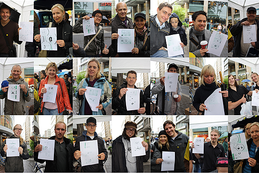
The public event worked in the same way asĀthe first marathon. People were asked to write their business name, a characteristic which describes them well and their type of business or profession on a piece of card. Then this 'brief' was written on the black board, the clock was set and everyone started scribbling. At the end of the table the results were evaluated. The bad ones went into one box and the good ones were copied and given to the 'client'. People from all kinds of backgrounds visited the stand: small business owners, an optician, a midwife, a psychologist, an actor, a spiritual cooking group, a catholic chorus, a bee keeper, the owner of a garden centre, a business coach, etc, etc. In general people who would never walk into a big design agency. Despite the rain everyone had a lot of fun and again we battled through 42 logos in just over 4 hours.
→ Download the Logo Marathon PDF (14.5 MB)
www.logomarathon.de
Disclaimer: The copyright of all work shown here is with the individual students. No work shown here was produced by Mind Design or Holger Jacobs. The final Logo Marathon identity was designed by Kris Braun and Christian Jakob.
