The End of Digital
This course was a one week block seminar as part of the Intra Muros program. Since the invention of the book there have been experiments with its form in relation to content and function. To break with the common form of the book and to look for alternatives that reflect its content has always been one of the major challenges in book design. The proclaimed 'End of Print' has never occured, quite the opposite, books and magazines became much more varied in form and subject matter. Our reading conventions have been challenged in many different ways and print design has entered a phase of experimentation.
Can the same thing be said for the internet? Everyone of us publishes, edits and comments on common web platforms such as Facebook, Twitter and YouTube. However, in contrast to the way we deal with books it seems that we are willingly accept their given format. There is still a lot of room for critical or creative experimentation. It seems far more important WHAT we publish (even if most of it is fairly irrelevant) than HOW we do it. In this course students were encouraged to use public web platforms against their intention, to hijack their original format and use it for playful creative experiments.
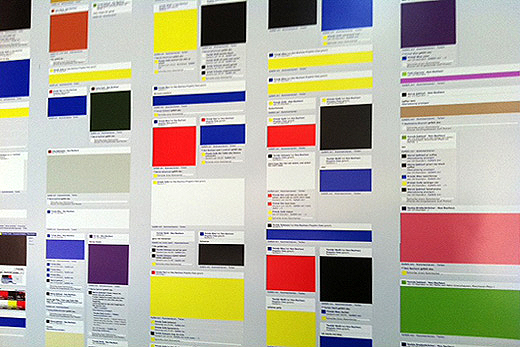
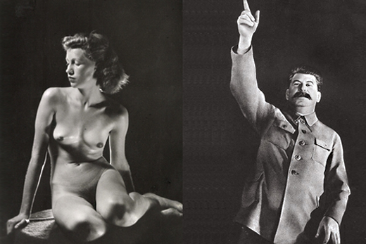
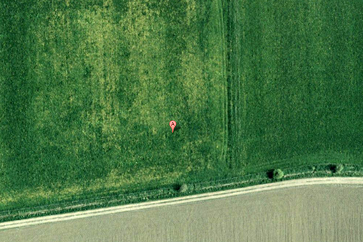
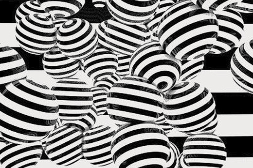
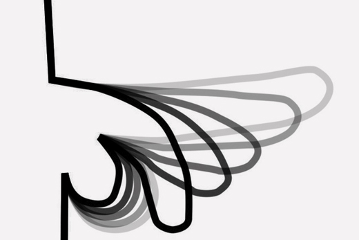
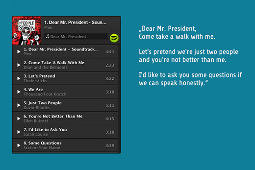
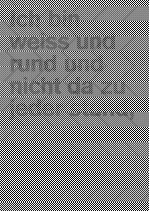
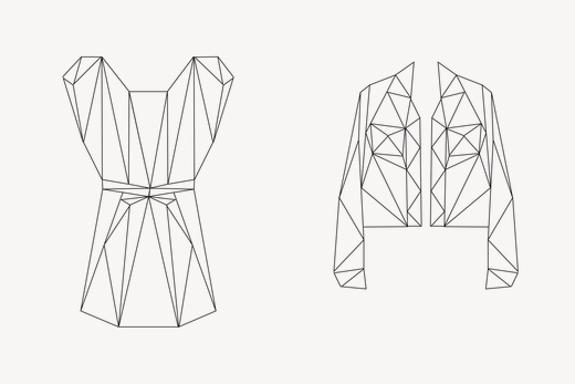
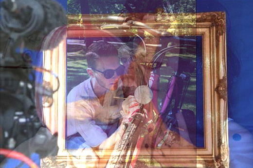
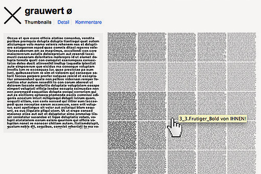
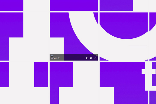
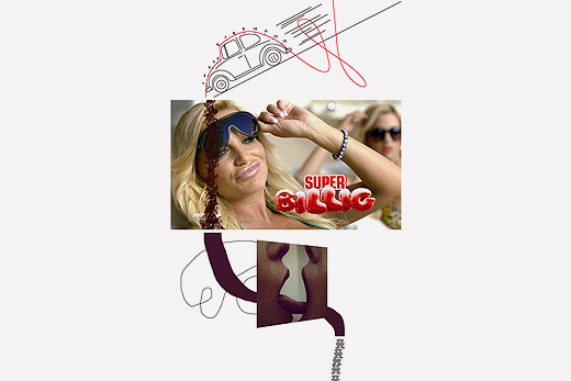
The results were often simple and surprising interventions: Just by changing profile photos and posts into solid colours Facebook was turned into an abstract Mondrian-like piece of art. Straight forward zooming in on Google Earth allowed to determine the 'middle' of cities, countries and continents according to Google (which were often just a bush, a lake, or some surprisingly uninteresting spot, certainly not a landmark in the capital city). Recently Google added a function to upload images and search for similar ones. Interesting to see what happens when you use pornographic images with the censorship filter switched on. Titles in playlists can be used as messages or represent well known speeches. Some students sold abstract drawings of non existing clothes on a second hand fashion website, used the picture grid of Flickr to investigate the 'grey tone' of different typefaces or fed video link comments through a computer speech program. Most workshop results can still be seen here.
Course description in German:
Seit dem es b³cher gibt ist mit ihrer form im hinblick auf inhalt und funktion experimentiert worden. Mit dem herk÷mmlichen (und auch dem praktischen) zu brechen geh÷rt zu den Herausvorderungen guter und interessanter buchgestaltung. Das immer wieder heraufbeschworene 'End of Print' ist nie eingetroffen sondern hat zu mehr vielfalt gef³hrt, unsere Lesegewohnheiten auf die probe gestellt und B³cher zum experimentierfeld gemacht. Aber wie sieht es eigentlich im internet aus? Jeder von uns publiziert, editiert und kommentiert im internet auf ÷ffentlichen platformen wie Facebook, Twitter und YouTube. Im gegensatz zum Umgang mit b³chern scheinen wir uns diesen bestehenden formaten jedoch wesentlich unkritischer (und unkreativer) unterzuordnen. So wie sie uns vorgegeben werden benutzen wir sie in der regel auch. Es scheint uns wesentlich wichtiger zu sein WAS wir ver÷ffentlichen als WIE wir es tun.
In diesem Blockseminar wollen wir uns mit der k³nstlerichen benutzung von ÷ffentlichen web platformen entgegen ihrer bestimmung beschõftigen. Zwischen den zeilen der vorgegebenen Benutzeroberflõche wollen wir nach neuen ungewohnten ausdrucksm÷glichkeiten suchen. Wir kennen klassische Bespiele wie ASCI das zusammensetzen eines bildes aus einzelnen thumbnails. Im grunde sind etablierte benutzeroberflõchen auch nichts anderes als zwei buchdeckel, da gibt es nor sehr viel spielraum. Diesen wollen wir ergr³nden. Die ergebnise sollen in einer digitalen publikation zusammengefasst werden.
Disclaimer: The copyright of all work shown here is with the individual students. No work shown here was produced by Mind Design or Holger Jacobs.